Facilitating gold loans through a self serve kiosk
Project Type
Professional project at Rupeek Fintech Pvt Ltd
My Role
UX Researcher and Designer
Methods
Concept testing, field research, semi-structured interviews, wireframing and prototyping, usability testing
Deliverables
Personas, Storyboarding, Usability test reports, Journey mapping, Overall UX research reports
Tools
Figma, Dovetail, Excel, Fullstory, Google meet
01
Context
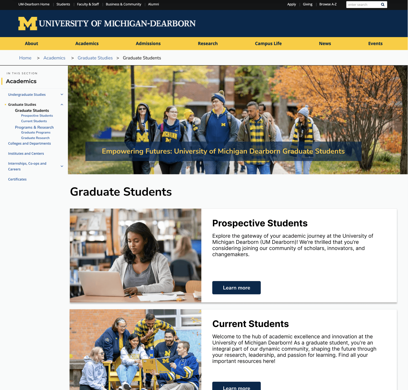
Gold Teller Machine (GTM) - A self serve machine for instant gold loans.
Rupeek is India’s leading asset-backed, digital lending fintech platform.
In the Indian context, gold is a very important asset that is used as a collateral for short term monetary requirements. Rupeek's main service is doorstep gold loans. With a massive gold loan demand , the purpose of the GTM was to make credit accessible across the economic pyramid, multiple geographies (Tier 1,2,3 cities, remote locations)
02
The Problem
03
Research Approach

04
Impact
8% ↑
Conversion Rate
85%
User Satisfaction (NPS)
100%
Task Completion
Researched, designed and launched the 0-1 product in accelerated timelines, and contributed to a task completion rate of 100% and increased conversion rate by 8%
Closely worked with the CEO, CTO, product, engineering and business teams and guided the product’s evolution
Mentored 2 interns while on this project in UX design principles, design system implementation, user research methods and agile UX
Here's a more detailed view of the project….
01
Project status when I started
Company had a concept and vision to digitize the end to end process of gold disbursement
First prototype of the physical and digital interface of the kiosk was developed by an external agency
No prior user research done
02
Research Questions
How do customers use/think/feel about existing options to avail a gold loan?
What factors influence a customer's decision when selecting a gold loan offering?
How might GTM positively impact the gold loan experience of customers?
03
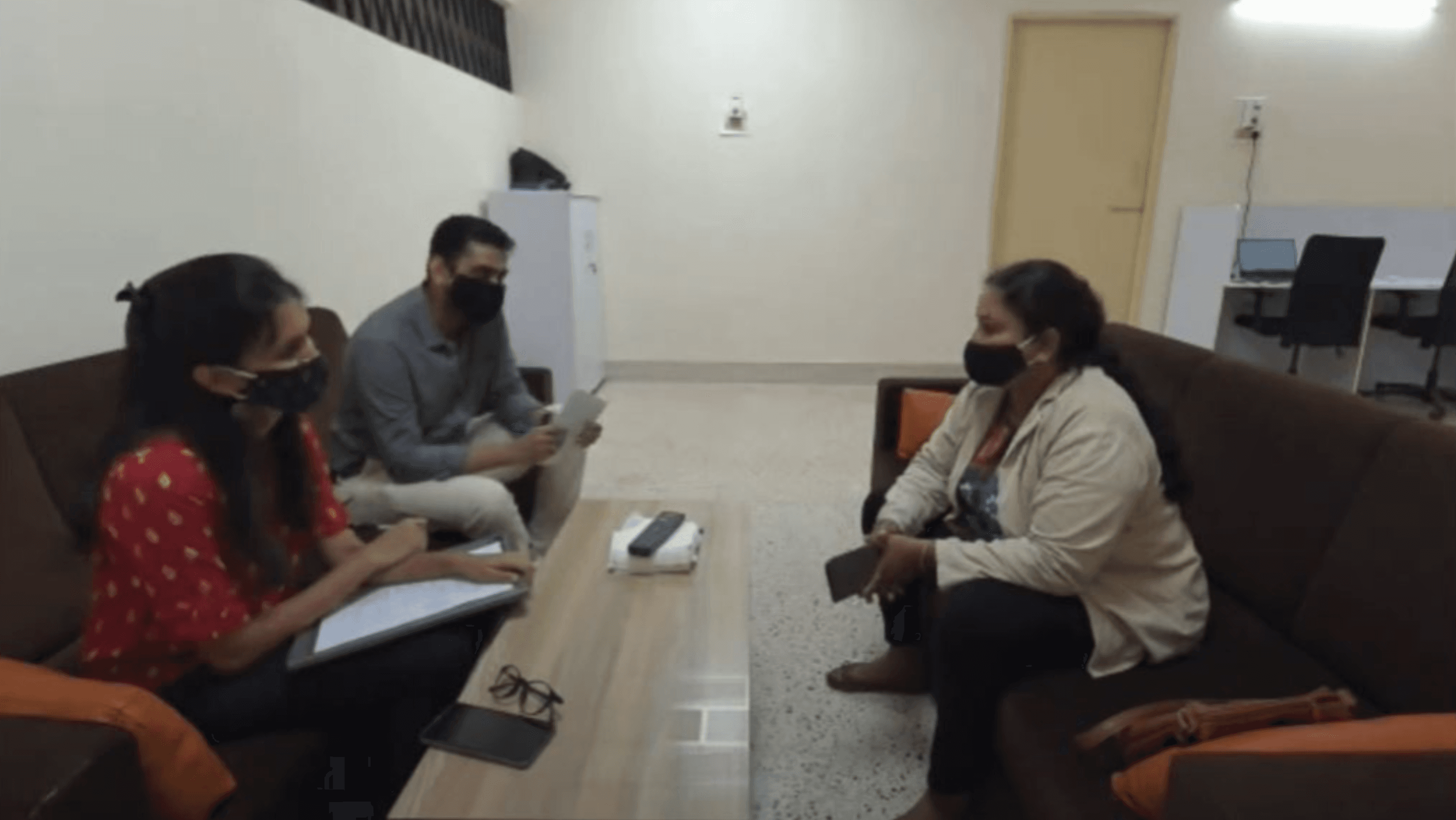
Field Research
Objective:
To study:
Process of loan disbursement
Process of gold handling
Time taken to process the loan
Interest rates
Nature of the environment
04
Concept testing with the first prototype
Method:
Semi structured interviews
Usability test at the research lab
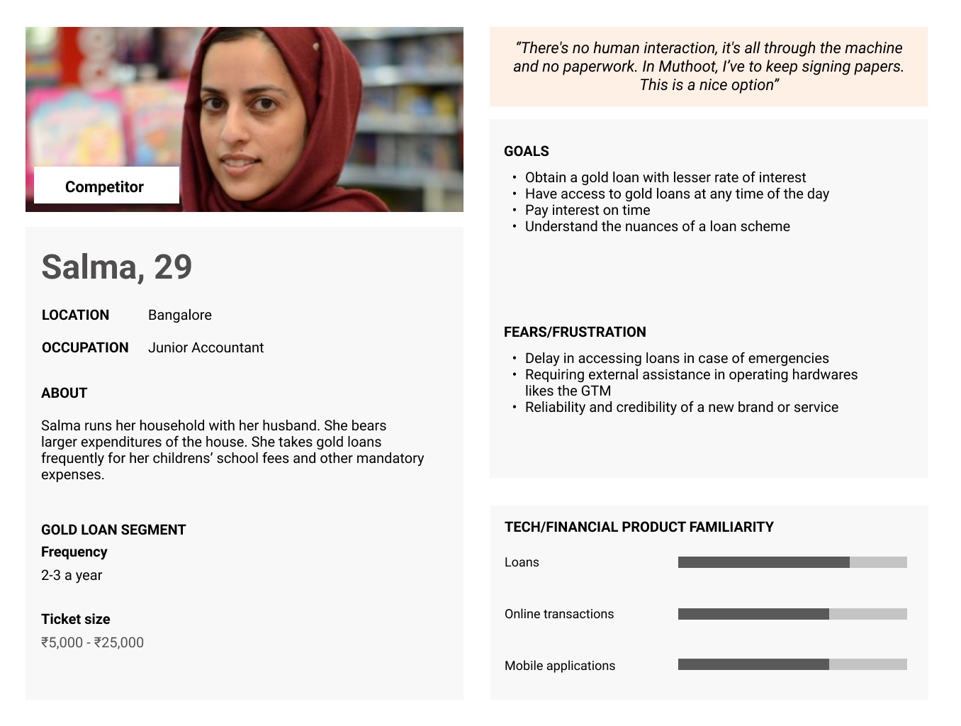
Cohorts: Competitor, Ex-Rupeek, New to Gold Loan customers
Structure of research
Demographics, tech and financial savviness
Gold loan history, experiences and decision making
Concept introduction
Usability evaluation
Concept feedback

Key Insights
GTM benefits appreciated by customers:
Convenience and time flexibility
Automated process, no paper work
Low social stigma of taking loans
Apprehensions with GTM:
Security and handling of jewels
Management of gold and loan disbursement during technical glitches
Key factors influencing customers' decisions while taking a gold loan:
Low Interest Rate!
Instant Money!
Users were frustrated with existing services due to long wait time and high interests.
Long processing time due to
Tedious documentation
Wait for appraiser at branches
Time taken with competitor services is between 1 hour to more than a day
Appointments for Rupeek Doorstep service are not always available
Some competitors offer higher rates of interest
Potential anchor points for GTM
No paperwork, no waiting at a branch
Low interest rates and quick gold loans
No human interaction- eliminates stigma/disrespect

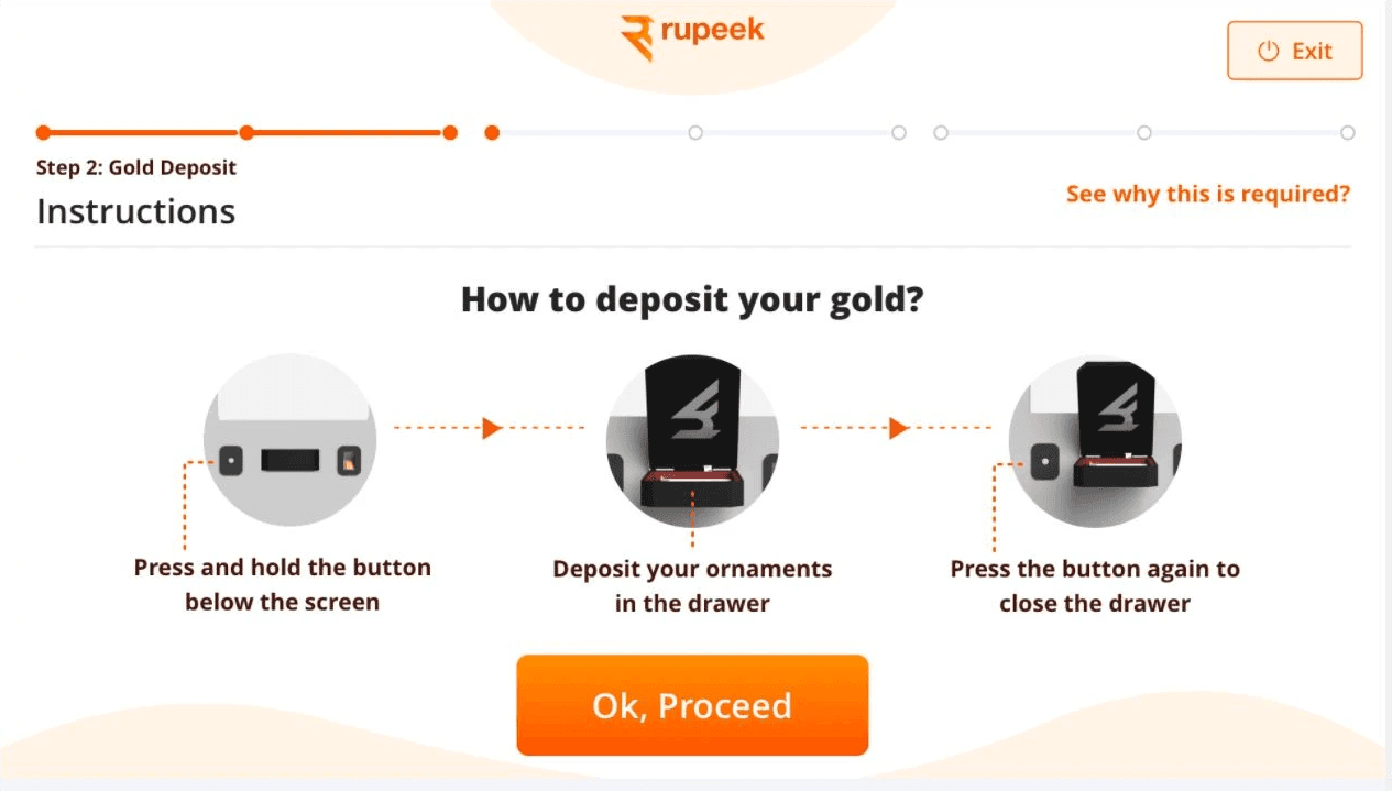
First prototype (Designed by an external agency)
Usability evaluation
UI:
Heavy textual content in the gold deposit screen hindered user comprehension. Visual assistance was needed
Clear system status on the UI was required to indicate actions such as box opening/closing and gold transfer to the backend
Vernacular language voice assistance would help in easier comprehension of the kiosk steps
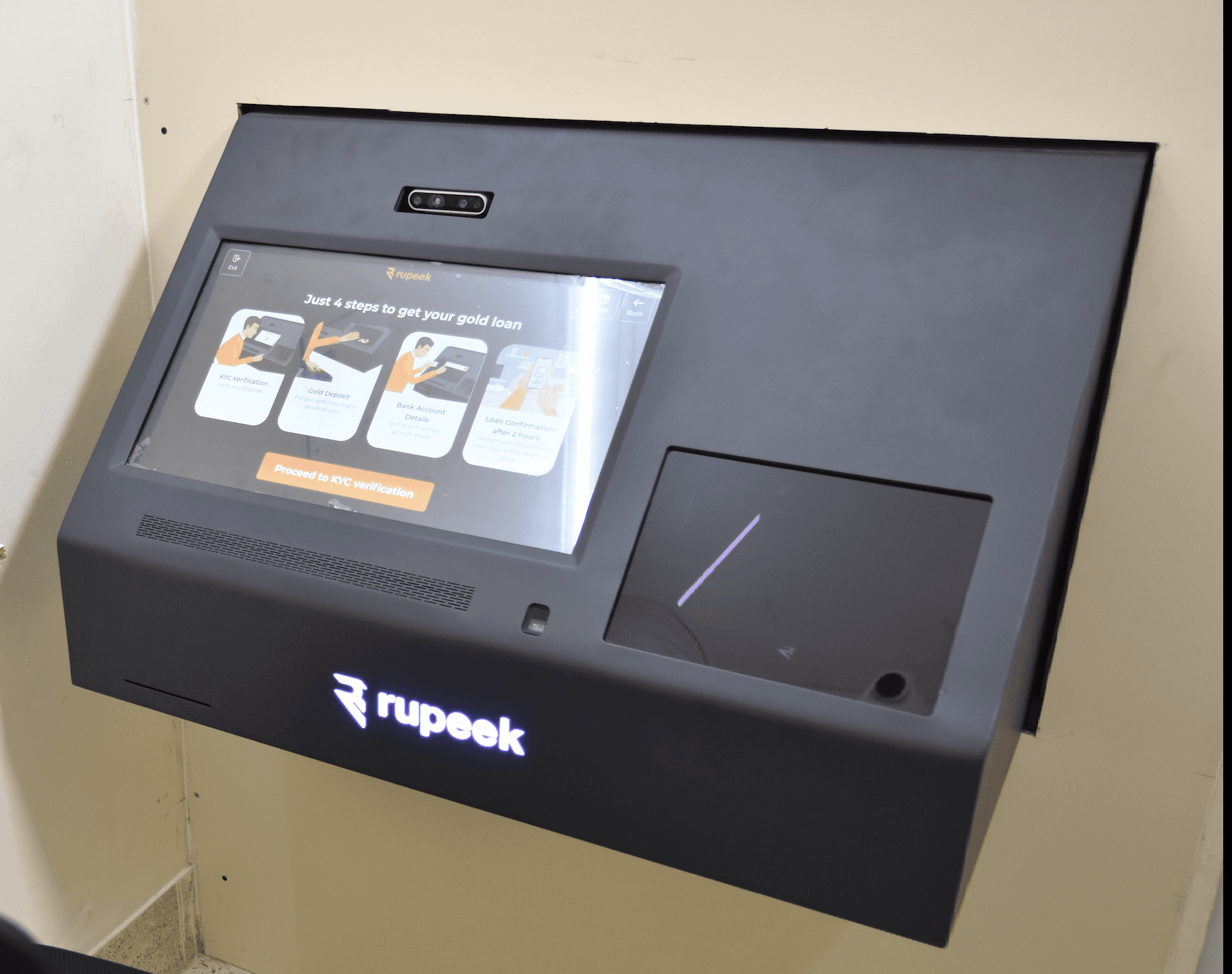
Hardware
An acknowledgment receipt showcasing a photo of the jewels deposited and the scheme selected would instill more trust in users
Affordances would be required to assist users with locating the biometric scanner and to help them place jewels within the deposit box

06
Usability evaluation of the second prototype
Method:
Usability test at the research lab followed by a semi structured interview
Sample size: 20
UI:
Manual capture of photo IDs caused confusion and users required assistance. An automatic photo ID capture would reduce effort on the users
Important information regarding next steps to receive the loan amount was skipped
Users required transparency as to where the gold will be stored
Hardware:
Users required an acknowledgement receipt with color photos of the jewels deposited
The opening and closing noise of the deposit box shutter startled users
Slow transfer of jewels that resulted in the long screen buffer time increased apprehension for users

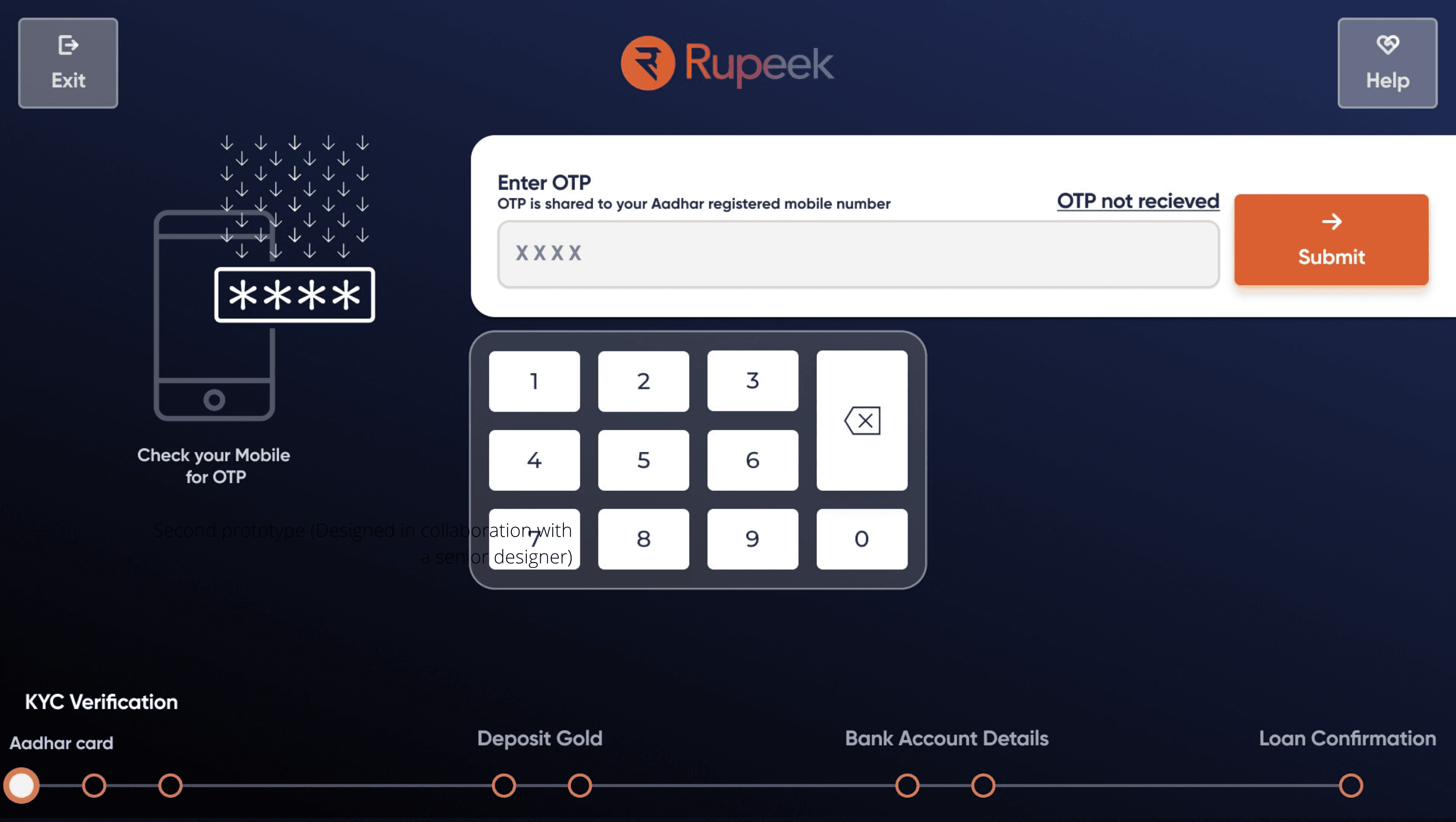
Second prototype (Designed in collaboration with a senior designer)
07
Pilot Launch
Based on user research and business alignment, the product was rolled out for a pilot launch.
Leads were generated through customer service/opener agents.
Total number of customer GTM was pitched to 108
Number of customers who visited the GTM location: 36
Number of transactions completed: 30
Achieved 100% task completion rate and 85% user satisfaction (NPS)
Conversion Funnel
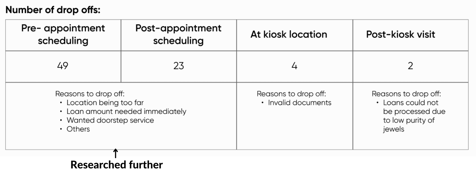
The conversion funnel revealed that most drop-offs occurred before customers even visited the GTM location. Upon further investigation, I discovered that the issue wasn’t with the user experience but rather with how the product was being pitched and customers weren’t clearly perceiving its value proposition. This research led to a shift in product direction, prioritizing product branding and operations over user experience to effectively reduce drop-offs

Collaborated with sales and operations teams to refine messaging and improve customer service training, leading to an 8% increase in conversion rates.
08
Reflections
Trust was the core UX challenge, not usability
Designing for a financial product involving physical assets taught me that trust must be embedded across the user journey not just the interface
I learned to be comfortable with ambiguity in research, especially 0 to 1 research
With no prior research, early field studies helped establish context and shape the right questions.
Hardware + software experiences require holistic research
Sensory cues like sound, motion, and wait times directly influenced user anxiety and confidence, emphasizing the need to research beyond screens and collaborate deeply with engineering.
Research impact extended beyond the product
Insights informed product positioning, agent scripts, and go-to-market strategy indicating how research can shape business outcomes, not just interfaces.
What I’d do differently:
Test more trust signals and failure scenarios, and invest in vernacular and other accessibility support.